

Text Size:

Overview
| Company Name | NIPPON STEEL CORPORATION |
|---|---|
| Head Office | 2-6-1 Marunouchi, Chiyoda-ku, Tokyo 100-8071, Japan |
| Established | April 1, 1950 |
| Common Stock | ¥419,524million |
| Fiscal Year End | March 31 |
| Stock Listings | Tokyo (Prime), Nagoya (Premier), Fukuoka, Sapporo |
【Concept of Brandmark and Logotype】
(Logotype)
The triangle in the logo represents a blast furnace and the people who create steel. It reflects the fact that steel, indispensable for civilization, brightens the world. The center point can be viewed as a peak, which represents the best steelmaker. It can be also viewed as the destination of a road, which represents the unlimited future of steel as a material. The blue color represents leading technology and reliability.
(Brandmark)
A common brandmark for Nippon Steel and the Nippon Steel Group was adopted in order to unify the branding as a group.
The brandmark is a combination of the corporate mark and the new English corporate name, Nippon Steel. As was the original font used in English, the typeface is roundish, representing a strong but yet flexible image of steel.
【Concept of Slogan and Logo for Environmental Management】
(Slogan)

(Activity Logo)
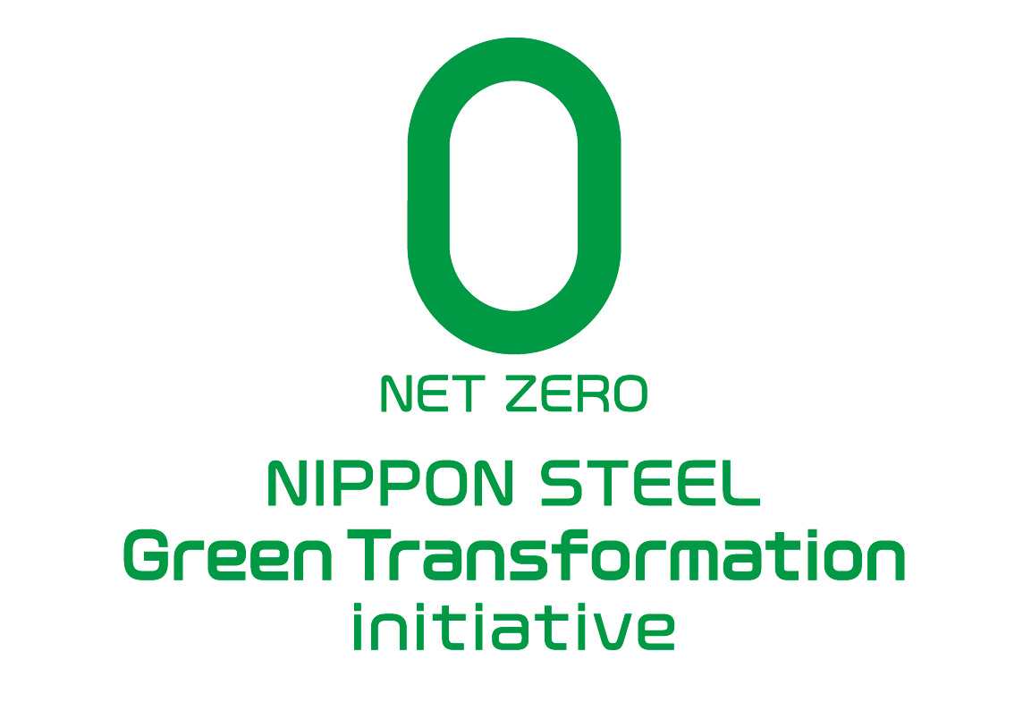
The "Nippon Steel Carbon Neutral Vision 2050" is based on Nippon Steel’s identification of global environmental issues as necessarily fundamental to corporate management. To support environment-related efforts the company has adopted a slogan and an activity logo. Our aim is 1) to resolve and declare that we will actively address them and 2) to express a particular focus on carbon neutral. We will actively promote our environmental management measures, particularly those related to carbon neutral, both in Japan and overseas, while utilizing the environmental slogan and logo.
The shape of the logo represents zero, and the color, green, is adopted for its “nature” association. In addition, our commitment is expressed in the tagline "NIPPON STEEL Green Transformation initiative”.